Sunrise Senior Living
Unifying 11 Luxury Brands Into One Scalable Template System
Sunrise Senior Living's 11 luxury communities each had their own website with completely different user experiences, creating operational inefficiencies and inconsistent navigation as they expanded their premium portfolio. We designed a unified microsite template that standardizes the experience across all brands while maintaining each community's distinct visual identity, delivering perfect usability scores and a 44% increase in leads post-launch.

The Challenge
Sunrise Senior Living had 11 luxury and distinctive communities—each with its own brand identity, content approach, and navigation structure. Every site was built individually, creating a fragmented user experience and operational nightmare.
Pages were inconsistent and difficult to navigate, failing to reflect the elevated lifestyle these premium communities offered. As Sunrise expanded its luxury portfolio, this fragmented approach wasn't scalable. They needed one templated solution that could adapt to each brand's identity while delivering a unified, sophisticated experience.
UX Lead
March – July 2025
American Express Global Business Travel
My Leadership & Approach
The senior living competitive set wasn't going to give us the answers.
None of the luxury senior living sites I reviewed delivered experiences that matched the level of care and lifestyle residents would receive. So I shifted focus to luxury hospitality and automotive brands—Ritz Carlton, Four Seasons, Belmond, plus Porsche, BMW, and Aston Martin—to understand how premium brands present dense information in elegant, simplified ways.
I led a 2-day in-person UX workshop at Sunrise's headquarters with our core team and their key stakeholders. The structure: collaborative review sessions followed by focused 2-hour wireframing sprints where I'd iterate based on our discussions, then return to the group for feedback. I facilitated every conversation, identified requirements in real time, and executed wireframe revisions on the spot or during work blocks. By the end of day two, we had approved wireframes ready for visual design.
After the workshop, I handed off approved wireframes to our UI designer and directed the visual design phase to ensure the user experience vision was maintained. Because our audience was older, I made strategic calls on which interactions to approve—keeping layouts elegant but ensuring they stayed intuitive and accessible. Luxury shouldn't come at the cost of usability.
Key Decisions I Made
The Solution
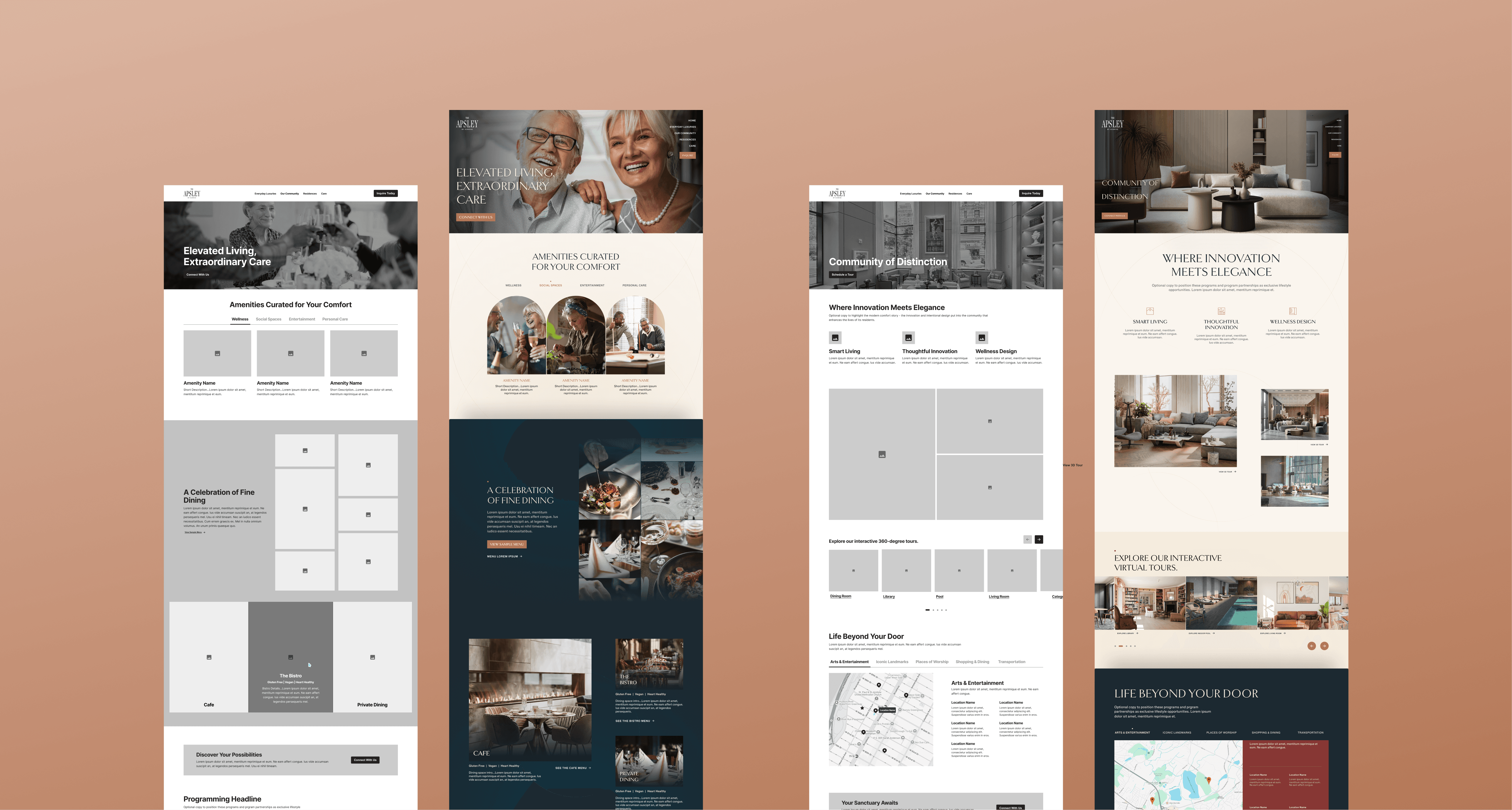
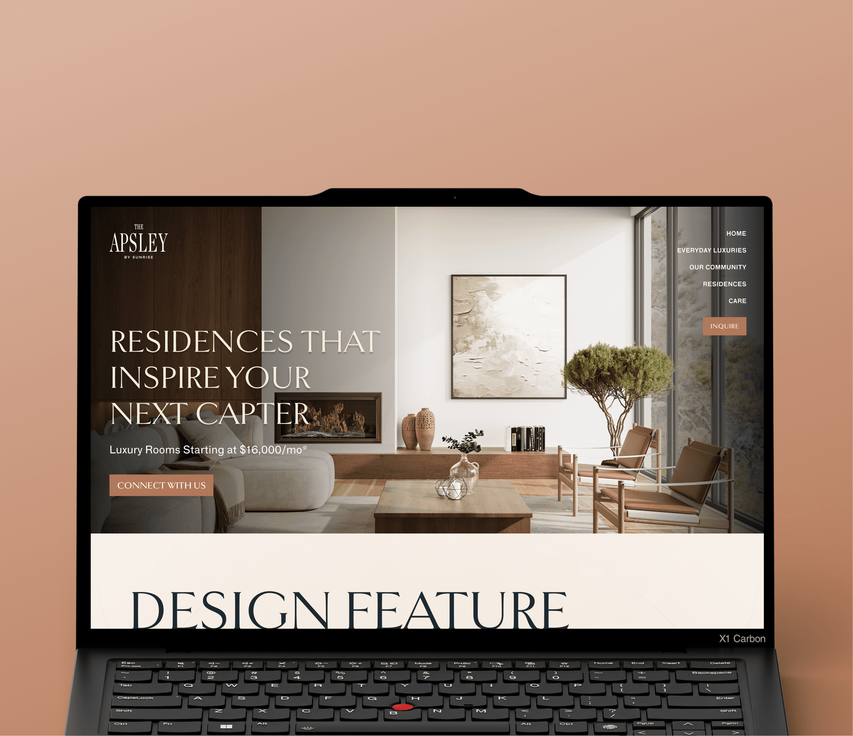
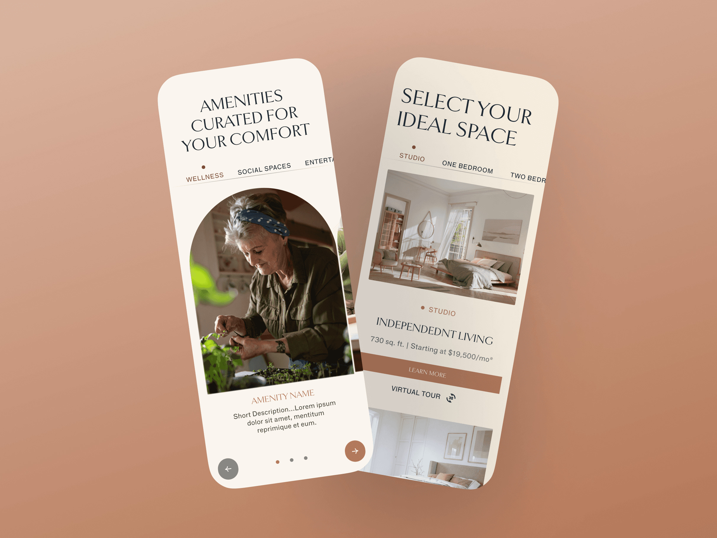
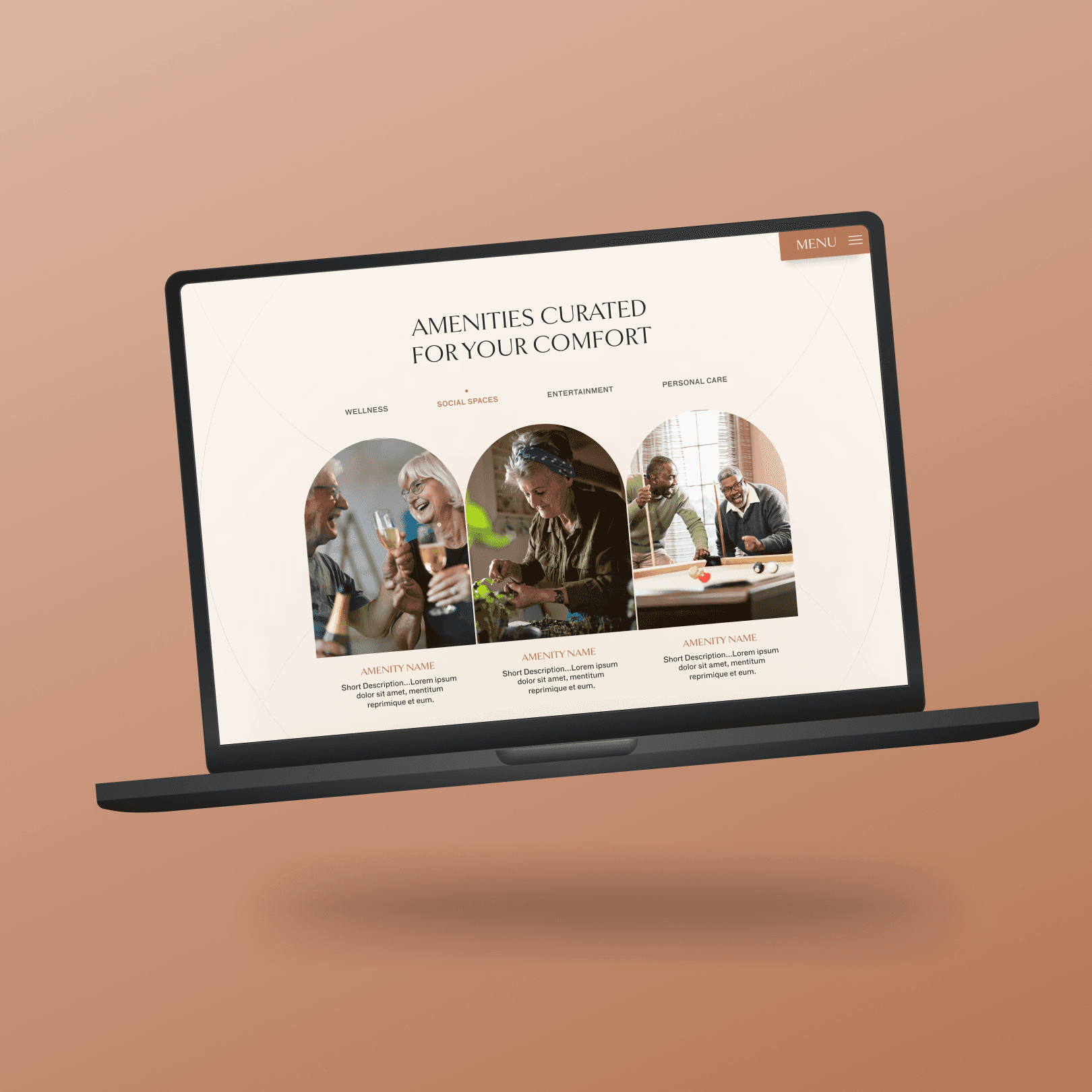
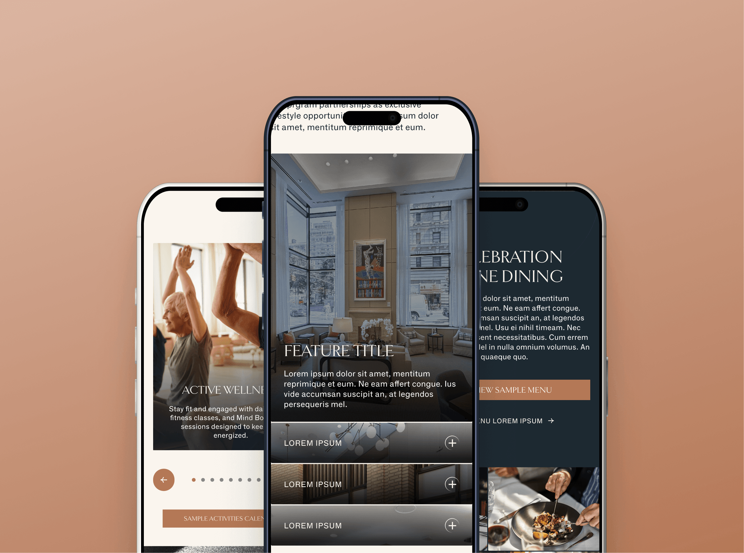
We designed a templated microsite experience that consolidated 11 fragmented luxury community sites into one scalable system.
Each brand maintains its visual identity through customizable stylesheets, while the underlying template ensures navigation consistency, content structure, and user experience quality across all properties.
The 4-page navigation tells a cohesive story: the lifestyle experience, the physical spaces, the residence options, and the care provided. Content authors can publish new communities by uploading a stylesheet and updating module content—no custom development required.
Before launch, we A/B tested the redesigned Apsley site against the existing experience. The new design achieved perfect usability scores and overwhelming user preference, validating both the strategic direction and execution quality.
Impact & Outcomes
In the 10 weeks following launch, the redesigned luxury microsite template achieved perfect usability scores and a 44% increase in leads—validating both the strategic direction and user experience quality.
44% increase in leads in the 10 weeks following launch
Perfect 7/7 usability scores across all tasks
Other UX Improvements
The new design scored 7/7 average on task ease across mobile and desktop (vs. 4.33 mobile / 5.17 desktop for the old design)
11 of 12 users preferred the new design, describing it as more modern, easier to navigate, and aligned with luxury positioning
Participants noted the experience gave them greater trust in both the community and Sunrise brand
What This Demonstrated
This project required me to see beyond the immediate ask (create luxury community pages) and solve the larger strategic problem: how do you scale premium digital experiences across multiple brands without sacrificing quality or operational efficiency? I led cross-functional collaboration from competitive research through validation testing, made critical decisions about navigation structure and technical implementation, and delivered a solution that increased leads by 44% while earning perfect usability scores. The result positioned Sunrise to rapidly expand their luxury portfolio with confidence.

